In 2005, Malcolm Gladwell wrote a fascinating book titled “Blink: The Power of Thinking Without Thinking.” In it — and broadly-speaking — Gladwell focuses on decision making and first impressions. Specifically, he reveals that the difference between making good decisions and bad ones has less to do with how much information we have and process than with our ability to focus on a few specific details.
In this article, I will show you how you can put this information to work for your apps so that you can, hopefully, see better returns for your time and effort.
What Is A “Blink Test”?
The term comes from Gladwell’s book and has to do with first impressions. It’s about the amount of information you collect in the initial two-second exposure to something. Believe it or not, you are able to collect all the information you need in order to make a decision with just a small sliver of time, 2 seconds. Some people call this “going with your gut” or intuition.
The Test Applied
Ok, so how do you apply this to the process of developing apps? You have to work with the notion that you have just two seconds to turn someone into a potential customer, and then eventually turn them into click the download button.
0) The Name of the App
Technically, it all starts with the name. The name of your app sets the tone for what is to follow. If you have an arcade game that has a ton of impressive eye candy and cool effects, you can’t call it “Space Shooter”.
1) The Icon
The app icon is the first thing people will see without taking any action. Review sites, for example, show the icon next to the title name (or very close by) before you see the text or any screenshots. It’s crucial that you nail the look of your icon.
Recently, Jeybee wrote a great post on how to focus on your icon to make it really stand out. I’m not going to repeat those points here, but I will show you some app icons and apply the Blink Test to them.
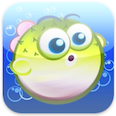 Pudge – Binary Hammer (yes, this is our app)
Good execution.
Blink Test: Passed (only just)
Eye-catching colors. Cute character. Overall a pleasant icon perhaps let down a little by the gloss. I find gloss-free icons to be more aesthetically pleasing than glossy.
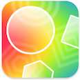 Polyhedra – Binary Hammer (yes, this is our app)
Poor execution.
Blink Test: Failed
Is colorful, but doesn’t “Wow!” Includes some shapes from the game, but is too abstract for the customer to figure out.
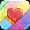 Etsy Lovers – Jeybee (from their post)
Perfect execution.
Blink Test: Passed (absolutely)
Great coloring, no gloss. Very appealing and does its job of making me want to know more about the app.
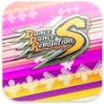 DanceDanceRevolution S (S) – Konami Digital Entertainment
Poor execution.
Blink Test: Failed
The word logo is small and the thick stroke makes it hard to read. Gets lost in the background.
2) The Screenshots
After the icon, the next thing to focus on is the screenshots. I talked about this already, but the main thing to remember is that focusing on the core gameplay gives the potential customer (remember, they haven’t clicked the Download button yet) more information on if they want to download your app. Granted, because of the blink test, they already know if they want to download it already; their gut has them leaning towards yes or no (or they just might not know it yet). The screenshots act as the reassurance to them that downloading the app is a good decision.
Regarding UIKit-heavy Screenshots
I’ll make a little aside here and mention UIKit-based applications. I certainly understand the decision to use UIKit, and that’s fine if it makes sense for your app. However, if you do make that decision, spend time on your interface. “Plain Jane” UIKit apps are notoriously boring to look at, so take the time to reskin your interface to make it really stand out and beautiful. Indeed, it is those apps the people notice and talk about.
3) The Description
I’d say the last thing people look at is the description. I think there’s a few reasons for this: 1) people just couldn’t be bothered to click the More link (myself included) to see the entire description (I’m talking about through iTunes on the desktop here), 2) when people are surfing the web, I’d say they spend most of their time reading. The last thing they want to do is read more stuff; most just want the quick payoff: does it look cool?
Where this gets fuzzy, and why you still need to give the description the respect it deserves, is how the app is priced. What I do is let the price tag dictate whether I consider reading the description or not. If it’s free or $0.99, I never read it. If it’s $4.99 or less, I might read it if the icon and screenshots haven’t convinced me. Anything over $4.99, I always read the description, and even then I add it to my Wish List to think about the purchase.
The Entire Package
Your app is more that just the executable; it’s everything combined together coming into play on whether people download your app or not. Making the sum greater than the parts and spending time with each part to make it perfect is what you should be aiming for. If any one link in that chain fails, it could prevent a potential customer from walking away.
One clue that tells you if you’re going in the right direction or not is if you feel compelled to ask someone “Does this suck?” If you’re thinking about asking this, you already know the answer (it does). Go back and keep tuning until you don’t need to ask.
An Example: Tiny Wings
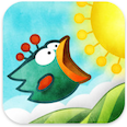 Tiny Wings was recently released by Andreas Illiger. If you haven’t downloaded it yet, stop reading this post and go download it right now!
The icon shows a cute little bird with tiny wings rendered in an uncommon graphic style. You immediately want to see more of it. Even the name of the game provokes an emotional response.
Once you click through (or scroll or whatever) to see the screenshots, you are presented with what you hoped for/expected: a game with unique and very pleasing visuals. Once you see the PR copy on the one that says “Procedural Graphics”, one look at the price ($0.99) turned this into a no-brainer instapurchase.
Once you load the game, you are presented with a very addictive game that drips character; the same kind of character that keeps us playing Angry Birds.
An absolutely charming iPhone game!