Wired’s new iPad app was released on May 26, 2010 and instantly became Apple’s iPad App of the Week. It has been touted as the future of magazines and a bold step forward for digital and interactive content. Indeed, someone who works in the publishing industry has even said, “It is, ultimately, the best digital magazine on the best platform yet for digital magazines.”
Before I get to the real focus of this article, I’ll list some of the features and technical specifications:
Exclusive iPad content.
Interactive features.
It supports portrait and landscape modes.
It costs $4.99.
It’s a 527MB download.
Wait, what? 527MB for just one issue (June)?! What could possibly take up so much space? It turns out I wasn’t the only one that had the same thought. Layton talks about how the app is structured in his recent article. In another, more technical article talks about how the app could be implemented using HTML 5. Here is another interesting and in-depth article. (I made a lengthy comment to that last article. This post is based on that comment.)
The Technical Stuff
The other articles describe in various details how the app was implemented, and since that’s the foundation of my post, I’ll briefly describe what it’s doing.
At its core, the Wired app is basically an image viewer with a few extra features. It supports portrait and landscape reading and also has some limited interactive elements (playing videos, showing an animation of 3D rendered characters, and so on).
There is a generic viewer app, which, to be fair, is tiny. The exe and supporting interface images is a mere 571KB.
There is full-screen video included in the bundle, but the total size for those is only 138MB. MP3 audio files consume another 24.1MB
You might be wondering by now what’s causing the bundle to be so large. It’s the content pages. (For those keeping track, we’re talking about 360MB.)
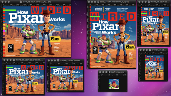
One of the main reasons that the interface is so pixel-perfect is because every page is a PNG image. A graphic artist created the layout (perhaps using the same layers as the print edition as a starting point), flattened it to an image, and handed that off to the programmers for integration into the app. Maybe a tool was created to simulate what the app does so a programmer might not even be needed. The graphic artist did this twice for every page in the issue. Once for portrait, and again for landscape.
In addition to those two versions are four additional copies of every page. There is a thumbnail and a preview version used for navigation.
Every article (not individual page) gets an additional image for the table of contents preview. Think of it as an icon for each article that the table of contents list displays next to each entry.
In the example below, I have shown all permutations of the front cover plus the thumbnail.
I processed these images and was able to reduce their footprint by 40% without changing the bit-depth. If done over the entire set of (over 4100) images, I think the savings would be significant.
All of the data is contained in a 1.5MB .XML file that describes each page in its various forms. It’s good to see the engineers have taken a data-driven implementation. This allows for a generic player to present issue-specific content and paves the way for future issues.
I find it curious that there is no feature reverse-pinch to zoom in. Why not? Since they’re images, it would be pretty straightforward to implement.
The Real Issue
There are some things that we as developers need to discuss: When does download size start to become a problem?
Somewhat intertwined with this notion is this fundamental question: does the user care what the download size is? From the comments I have seen in my research for this post is that no, the user DOES NOT CARE about download size, as long as the experience meets their expectations.
As developers, we have been trained to do things as efficiently as possible. (This is actually debatable now. Recent trends indicate that developers on ‘capable’ platforms don’t care about efficiency. A topic I will address in a future post.) That always becomes a trade-off between time, cost, and quality. My question to those users that don’t care about download size is, “WHY don’t you care about download size?”
Why do we developers (granted, I am a game developer, but in this case, software is software) spend so much time on making everything perform as efficiently as possible when the user doesn’t really care? I think for me, the driving factor is what other developers think of the solutions I have engineered.
What I don’t respect is the solution the Wired developers have implemented. To me, there is something fundamentally wrong with a magazine that is over 500MB. It’s just a stylized image viewer. Surely there’s a better way to implement it than images.
Wired is not the only popular app that uses a similar solution. Alice for iPad is an example. No one really noticed because it was a relatively lightweight (when compared to Wired’s certainly) because it only supports portrait, has far fewer pages, etc. However, the implementation is the same: highly stylized pages essentially presented as a slideshow.
Are you from The Future™?
The Wired app has been touted as the (possible?) future of magazines, but is it really? As developers, is this what we have worked so hard for? Get the artists to render every single page 6 times and slap them in? In my opinion, this doesn’t push our craft forward. Quite the opposite, in fact.
Do the users care? Mostly not.
Does Apple care? Not in the slightest because the Wired app instantly became the iPad App of the Week.
Do the developers care? Obviously not (right now) because they implemented this solution…and they’re seeing their app become the Top Grossing App. Perhaps it was purely a time constraint with this first digital issue and they’re going to address the problem in future issues. Only they would know that. Given the recent news, one can only hope they will. The official Adobe page on digital publishing was unveiled today.
You might have noticed that I haven’t talked about the cost. I did this for a reason: I don’t care what the cost is and it’s not related to the point I’m trying to make. It could be free and I would still not respect the implementation decisions.
UPDATE RE: VERSION 1.1
The v1.1 update to the app was just released (June 30, 2010) and the download size is MUCH smaller than v1.0. Just a mere 5.5MB. What they have done is only included the player, and not the content. The content is available as an in-app purchase. If you have purchased v1.0, the content to the June issue is free.
The size of the June content is still 500-odd MB, so I suspect the same holds true for the July issue. However, it is promising that they have used the techniques described in my earlier post and are slowly coming to grips with the problem of download size.